


Consumer Experience
Designer of a scalable, rich consumer experience
Consumer Experience
Designer of a scalable, rich consumer experience
storefronts overview
I had the privilege of being a part of eCommerce history by designing the first ever multi-channel fully transactable Ad Unit. As the UX lead, I was tasked with structuring a flow through the storefront interface that achieved the same access to the product exploration that specific brands could offer on their website, complete with shipping and payment information. The scalability of the feature set was very important as the storefronts varied from desktop to mobile across three different ad sizes.
Ad Units
To give brands the most opportunity to reach their audience, we offered many ad experiences. I designed transactable ad units that gave the customer the full conversion opportunity; interactive ads that gave the customer complete product exploration; and static ads that linked a customer back to the brand’s website.
Mobile
The mobile experience gave me an opportunity to utilize common scrolling and swiping behavior and cut out a few steps in the exploration flow.
Desktop
I created the desktop storefront for customers who prefer a richer experience combined with a stronger sense of security.
Planning and Process
Research, testing and validated checkout flow optimizations
Planning and Process
Research, testing and validated checkout flow optimizations
UX
All of the storefronts went through an iterative development as we pinpointed drop-off in the conversion funnel. Flowing out the possible stages of the interaction was important to aid in understanding how steps could be combined, broken out or cut altogether.
Merchant Tools
Creator of an interface designed with data visualization patterns to optimize consumer understanding
Merchant Tools
Creator of an interface designed with data visualization patterns to optimize consumer understanding
Merchant tool overview
The merchant tool is an interface for brands to track product performance, view consumer patterns and easily execute campaigns against that data. I was brought on as UX lead designer to take the existing unfinished framework and designs and complete the interface for initial launch. Once the first version was realized, I led an initiative to revise the merchant tool with scalable visualization patterns to accommodate growing engineering capabilities.
Rich Feature Set
Presenting navigation, global features and framework consistently across pages enabled the array of varied features to be quickly identified by the user, keeping the learning curve for new users to a minimum.
Data Visualization patterns
When possible I incorporated data visualization elements that are commonly used and easy to understand. In some cases I wanted a new way to present data such as hourly conversions in a radial graph to mimic a clock face. A great front end developer was able to execute my design.
Planning and Process
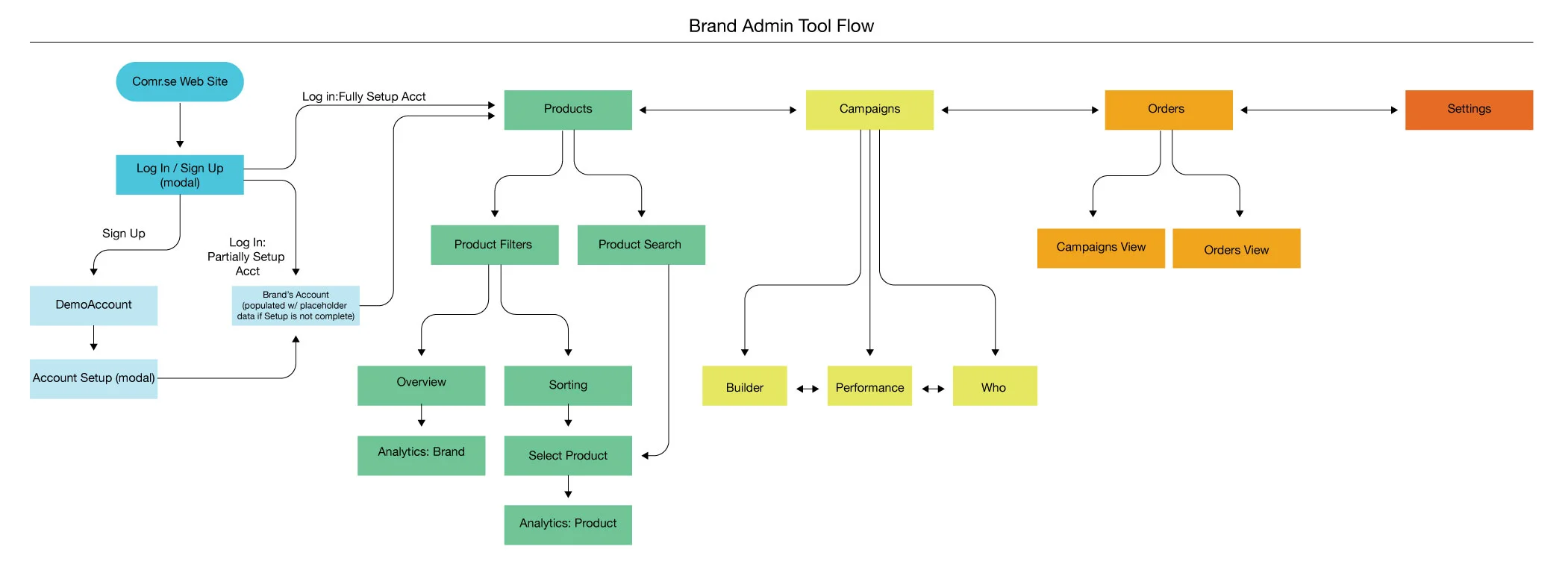
I led the organization of a merchant tool capable of filling the needs of small to medium sized businesses
Planning and Process
I led the organization of a merchant tool capable of filling the needs of small to medium sized businesses
UX
When I put myself in the shoes of the user for the interface of such a versatile tool I wanted the navigation to focus on the essentials. The user has a product, they want to build a campaign to sell products and they want to see the resulting orders. The flow of the tool was based off those three components which drove the corresponding design.
Comr.se Website
Website, corporate iconography and marketing material designer
Comr.se Website
Website, corporate iconography and marketing material designer
Comr.se website
Startups are agile and relentless. As features and capabilities change, it is important to keep the information and the way it is presented current. Presently Comr.se is positioned to offer products in the form of services as software. I had to create an interface that served two audiences: Marketers want a marketing- heavy product explanation and engineers require technical content to understand how to implement the Comr.se API services into their own platform.
Product overview
A use case of a brand’s product working it’s way through each API along with a clear description shows customers how their products can utilize the Comr.se software.
Technical documentation
A dynamic menu to the left of a scrolling section of code snippets shows engineers exactly how the software works.
Assets
I defined a visual strategy to help tell the story of Comr.se
Assets
I defined a visual strategy to help tell the story of Comr.se
Corporate Iconography
The current positioning of Comr.se is providing powerful APIs to customers. I designed a clean family of marks suggesting their function. This visual brand language formula is scalable, enabling future marks to be created for additional products. Having two primary audiences required thoughtful development of assets to be utilized for marketing-minded customers as well as technical engineers.
Marketing
Depending on the audience - a new customer lead, a stakeholder, or a large company looking to potentially acquire Comr.se - I incorporated an extensible visual language. The range stretched from simple icons for macro descriptions of product to well-organized simple data flow visualizations and even mocked-up detailed integrations of the Comr.se platform into the interface of potential acquiring companies.
TEchnical
On many occasions, the need for a micro-explanation of very technical information about the Comr.se services and platform was required. With an engineer’s perspective in mind, I developed a specific styling to foster a quick grasp of data flows.